
Quick Nav
- Give the booth one obvious entrance
- Turn tables to create a natural visitor path
- Keep the waiting line away from browsing space
- Split ordering, payment, and pickup into three stops
- Let visitors read the main sign before they reach you
- Put popular and ready-to-go choices closest to service
- Reserve a clear counter zone for payment
- Move handouts to the aisle edge
- Mark a separate pickup point
- Hide restock supplies below the display
- Leave room for comfortable decisions
- Rehearse the busiest five minutes
Which Booth Change Will Shorten Your Line First?
Which booth change will help you serve the next visitor faster?
The answer depends on what that visitor needs to do. A craft shopper wants room to browse. A food customer wants to read, order, pay, and collect food without doubling back. Someone approaching a nonprofit booth may need a greeter, a brochure, or a quiet place to complete a registration form.
Start by watching where feet stop. A visitor who cannot identify the entrance, menu, or next service point may hesitate for 3 to 5 seconds before walking on. Remove that physical bottleneck before improving decorations. Inside a standard 10-by-10-foot outdoor footprint, every table corner and storage bin affects the path.
Fix The Stall
Observe one busy interval and mark the first place where visitors pause unexpectedly. That spot usually identifies the booth change with the quickest payoff.
1. Give the Booth One Obvious Entrance
A clear opening answers the first question facing an approaching fairgoer: “Where do I go?” Frame that opening with the front corners of tables, display racks, or a freestanding sign. Keep at least 36 inches clear so visitors using mobility aids and adults pushing strollers can enter comfortably.
Display racks can close distracting side approaches while guiding traffic through one manageable threshold. They should define the route without projecting into the aisle or squeezing the entrance.
For Information Booths
Place the greeter beside the opening rather than in its center. Brochures, children’s activities, and registration materials can sit farther inside, giving the next visitor room to enter while a conversation continues.
2. Turn Tables to Create a Natural Visitor Path
A solid table across the front creates a counter, but it also keeps visitors standing in the fair’s main walkway. L-shaped and U-shaped arrangements invite people inside the assigned footprint.
One useful setup turns an 8-foot folding table at a 90-degree angle to the aisle. Its outer end marks the entrance, while its long display-facing side creates a browsing run. A second table can form the service counter or back boundary.
Keep staff movement behind the counter. Visitors should follow the merchandise-facing side from entry to exit without crossing the restocking route.
3. Keep the Waiting Line Away From Browsing Space
People still choosing need different space from people ready to order or pay. When those groups overlap, the queue blocks menus, demonstrations, signup sheets, and merchandise.
Map the anticipated line along one outer edge of the booth. A practical planning allowance is 4 to 6 feet of dedicated queue space running parallel to the boundary rather than diagonally across the display. Cones or stanchions can help when fair rules permit them and every part remains inside the assigned area.
Protect The Aisle
A boundary should organize the line within the booth footprint. It should never transfer the bottleneck into neighboring exhibitors or general fair traffic.
4. Split Ordering, Payment, and Pickup Into Three Stops
A three-stop sequence makes a food booth readable at a glance. Arrange the menu and order point first, payment immediately afterward, and pickup at the far end. A left-to-right flow often feels familiar, though the booth’s approach direction may justify reversing it.
Separating each task reduces cross-traffic among customers, cashiers, and staff assembling orders. Keep about 24 inches between the payment terminal and pickup staging area when the counter permits. This gives a paying customer room to finish while the previous customer collects an order.
This layout needs at least 10 feet of frontage. In an 8-foot space, combine ordering and payment so pickup retains a usable position.
5. Let Visitors Read the Main Sign Before They Reach You
The primary sign should work while visitors are still approaching. For a food vendor, that means the menu and core prices. A nonprofit may lead with its mission or the activity offered at the booth.
Test the sightline by walking past at a normal fair pace. Elevating the main message to roughly 5.5 to 6 feet can keep it visible above tabletop displays and the customer currently being served. Large lettering and a clean angle matter more than squeezing every detail onto the board.
Give the first sign one job: help the visitor make the next decision. Place ingredients, product notes, or longer participation instructions beside the relevant station.
6. Put Popular and Ready-to-Go Choices Closest to Service
Group inventory by transaction speed. Frequently requested merchandise, packaged food, forms, and brochures belong within easy reach of the person serving visitors. Placing these items beneath the staff member’s dominant hand can eliminate repeated turns and long reaches.
A 15-to-20-second transaction target is a useful setup benchmark for grab-and-go items. Slower-to-explain products can occupy a separate browsing area where one detailed conversation will not halt simple purchases.
Small Items at Checkout
Commercial vendors can place compact add-ons near payment, provided they do not cover the counter or card reader. A shallow tray works better than a tall basket that hides the transaction area.
7. Reserve a Clear Counter Zone for Payment
Set aside an 18-by-18-inch payment quadrant for the cash box and card reader. Keep display baskets, samples, loose literature, drinks, and personal belongings outside that square.
The cashier should be able to reach bags, receipts, and change without repeatedly turning away. Secure charging cords behind the counter so they cannot snag merchandise or a customer’s hand. Prices belong upstream, where visitors can see them before arriving at payment.
Payment Stays Clear
Reset this square whenever traffic eases. A clean payment surface prevents tangled cords, dropped cash, and merchandise damage during the next rush.
8. Move Handouts to the Aisle Edge
Some visitors want a schedule, entry guide, or nonprofit brochure without starting a conversation. Put these low-commitment materials at the front edge of the booth so a passerby can take one without stepping into the service line.
Outdoor handouts need wind control. A weighted acrylic holder about 2 inches deep keeps the stack contained while leaving the top copy easy to grasp. Refill from behind the display instead of placing backup bundles on the public counter.
Keep registration forms and materials requiring explanation farther inside. Their placement signals that visitors should pause and speak with staff.
9. Mark a Separate Pickup Point
Pickup needs a visual anchor at the far end of the service counter. A short sign, contrasting tray, or open counter gap tells customers where completed orders will appear and draws them away from the ordering station.
Reserve a 12-to-16-inch gap for sliding finished orders forward. Avoid filling that opening with napkin dispensers, tip containers, or product displays. Staff should also call the identifying order detail from the pickup position, so waiting customers look toward the right place instead of crowding the cashier.
10. Hide Restock Supplies Below the Display
Backup inventory supports fast service only when staff can retrieve it without searching. Assign separate under-table zones for stock, packaging, cleaning supplies, and personal items.
Opaque 14-gallon bins fit beneath many skirted folding tables and keep visual clutter away from customers. Tuck each bin completely behind a floor-length table skirt, with labels facing the staff side. Nothing should protrude into the footpath.
Place the fastest-moving restock bin nearest its point of use. A food booth might keep packaging below pickup while a craft booth stores extra bags below payment.
11. Leave Room for Comfortable Decisions
Families often need a moment to compare products, discuss a purchase, or help a child complete an activity. Give them a step-aside zone away from the register.
A 3-foot-radius area near the back corner of the browsing space can handle this pause without stopping the line. It also suits raffle tickets and short registration forms. Keep the area free of backup chairs and boxes, and avoid positioning it in the staff route between inventory and service.
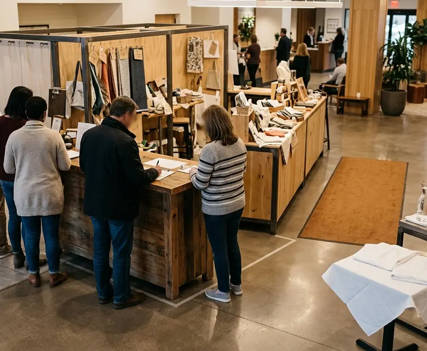
The result feels calmer: browsers can think while ready customers continue toward payment.
12. Rehearse the Busiest Five Minutes
A floor plan can look orderly before opening and unravel when three needs arrive together. Run a 5-minute drill with volunteers acting as indecisive browsers, paying customers, and restockers. Processing 10 to 12 simulated orders gives the team enough activity to expose table corners, crossed routes, and poorly placed supplies.
Move only the objects causing friction. Then write a short reset checklist covering the entrance, queue edge, payment quadrant, pickup gap, and under-table storage. Use the final 10 minutes before the gates open for those physical adjustments.
Near Cy Anderson Fellowship Hall, a volunteer squares the brochure holder with the aisle while the cashier clears the card reader’s corner. The first family approaches, sees the entrance, and walks straight to the activity table as the fair opens.

Comments
No comments.
Write a Comment